

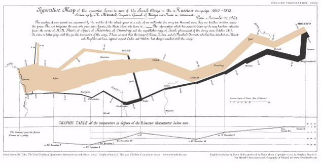
 Minard’s original (translated)
Napoleon’s 1812 invasion of Russia was an epic disaster. By the time he reached Moscow, he had lost most of his troops. The few survivors then limped back home, losing even more on the retreat. Fifty years later Charles Joseph Minard drew a graphic representation of the fiasco.
Edward Tufte famously wrote that Minard’s piece “may well be the best statistical graphic ever drawn.” It is indeed a masterpiece. But shall we leave it on a pedestal, or learn from it and see if we can improve upon it? Other designers have taken a crack at reworking it. Here is my attempt, followed by my critique of Minard’s and a bit of the rationale behind mine.
MINARD’S ORIGINAL (translated)
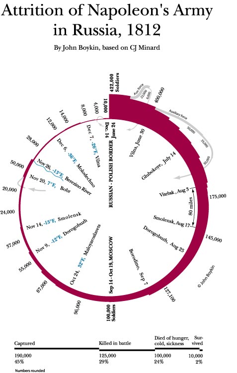
MY REDESIGN
Why Redesign Minard?
Mostly for fun. But I have always been a little troubled by the problems discussed below. Minard was way ahead of his time and deserves immense credit for having advanced the field of information design dramatically. But time marches on. So I have presumed to try to streamline his graphic to tell his story a little more simply and clearly.
Strengths of Minard’s Figure
As Edward Tufte points out in his classic book “The Visual Display of Quantitative Information,” Minard manages to represent many dimensions of the story: the size of Napoleon’s army at any given spot along the way to and from Moscow, his geographic direction and route, and the temperature on certain dates.
Minard’s basic idea–using an ever-thinning line to represent the attrition of Napoleon’s army–is brilliant. So is his correlation between troop size and geography. He masterfully lets the thickness of the line, rather than numbers, tell the story. Showing the rising and falling of temperature along the way graphically is helpful.
Weaknesses of Minard’s Figure
DOMINANCE: The whole point of the graphic is attrition, represented by the thinning of the line. Yet Minard’s dominant visual statement is not the line’s thickness, but its overall shape: more or less horizontal, zigging and zagging  irregularly, with a couple of branchings and with two differently colored sections that are irregularly spaced from one another. The overall shape distracts from the thinning.
The geographic tail, in other words, wags the numerical dog. If one does a little research about Napoleon’s Russia campaign, one soon realizes that the zigs and zags of the line’s shape more or less correspond with the geographical route Napoleon took.
But this is not apparent to most people looking at the graphic. If the route details would be meaningful to most viewers–like, for example, in a city bus map designed for commuters–that would be one thing. But the particulars of Napoleon’s route are of little interest to anyone but Napoleonic scholars and people intimately familiar with Russian geography.
Perhaps such people were Minard’s target audience in 1861, in which case his emphasis on geography would be appropriate. But now, some 150 years later, his graphic has been lifted from its original context and is presented to a non-scholarly audience as a freestanding work. As such, it suffers because the minor matter of the route takes visual priority over the real main point, the thinning. Geographical route information certainly should be included, but should not overshadow the main point.
GEOGRAPHY VS. CHRONOLOGY: Minard also lets geography eclipse chronology. He gives no dates for any point in the invasion; in the retreat, he gives dates only for the handful of temperature readings at the bottom. The only place name he gives that will mean anything to most viewers is Moscow, but all viewers would understand the story told by a procession of dates. The shortage of dates also easily leads to misunderstandings: Even Tufte assumes that the freezing retreat was during the winter, when in fact it was all during the autumn.
COLOR: I have shown Minard’s original to a number of people who had not seen it before, explaining only that it is about Napoleon’s loss of troops in Russia. I wanted to hear their uncoached interpretations. They tended to dwell on Minard’s use of one color on the top and a different color on the bottom, wondering what that signified. It confused them and distracted them from the main point, the thinning of the line.
The reason for their confusion is that a difference in color implies a difference in meaning: The gold line must mean something different from the black line. Here, it really doesn’t. Functionally, the color difference serves to keep the two more or less parallel lines visually distinct. Gold is for the invasion; black is for the retreat. We tend to look for some further difference in meaning, and our failure to find one produces confusion.
![]() SAWTOOTH: As the invasion (top half) line thins, each “sawtooth” between Wilna and Witebsk jags in along both the top and the bottom edges of the line, so the effect is weakened by half. In other words, if, say 30,000 men were lost at a given point, the line jags by 15,000 along its top edge and by 15,000 along its bottom edge.
SAWTOOTH: As the invasion (top half) line thins, each “sawtooth” between Wilna and Witebsk jags in along both the top and the bottom edges of the line, so the effect is weakened by half. In other words, if, say 30,000 men were lost at a given point, the line jags by 15,000 along its top edge and by 15,000 along its bottom edge.![]() That halves the impact you would get by having a single edge of the line jag by 30,000. (Curiously, Minard does not do this elsewhere. If he had, the sharp dropoff at the Berezina River would have lost much of its drama.)
That halves the impact you would get by having a single edge of the line jag by 30,000. (Curiously, Minard does not do this elsewhere. If he had, the sharp dropoff at the Berezina River would have lost much of its drama.)
TEMPERATURE: First, his means of both showing the temperature data and relating it to the main graphic are awkward. He relies on a lot of horizontal and vertical lines that convey very little data yet distract from the main graphic. The main contribution of the other designers whose efforts to redesign Minard I’ve seen, is to eliminate the need for all of these ungainly lines by using color in the main troop-size line to represent temperature changes. (T hat’s very smart. I would have done the same had I been able to find reliable weather data on which to base it. But Minard and I both can show temperature data only for the retreat, and then only for sporadic dates, because the weather records are spotty. I don’t know where the other designers found the data.)
Second, knowing a temperature for Monday and a temperature for Saturday does not necessarily tell you the temperature for Thursday. Yet Minard connects each of his sporadic temperature data points with a straight 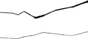 line, implying a smooth continuity of temperature that may or may not be accurate.
Third, the resulting contour of the temperature line, roughly mirroring the contour of the retreat line, suggests a relation between the rising and falling of the two. But there is no relation between the two contours: A rise in the retreat line represents traveling geographically northwest while a rise in the lower line represents warmer weather.
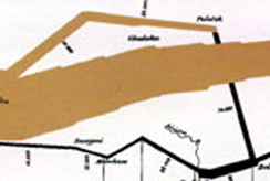 BRANCHINGS: Twice, early in the invasion, parts of the army branched away from the main force. Both rejoined it on its retreat. To be accurate, any graphic must represent those branchings–but how? If there is an elegant way to show them, neither Minard nor I have come up with it. None of the people to whom I showed Minard’s graphic felt confident in guessing what these branchings signified, though a few did guess right.
In his treatment, one of the branchings becomes the most prominent visual element of the left half–calling attention to something that most people find confusing. The other branching (A) has the opposite problem: A critical part, the rejoining line (B), is so small as to be overlooked entirely. Given Minard’s overall scheme, he had little choice but to make that rejoining line tiny. But the result is that it all but disappears, leaving most viewers wondering what is meant by the two vertical lines (A) above it that seem to lead nowhere.
Notes On My Redesign
The piece should be self-explanatory. I offer these notes only for the interest of other communication professionals who might like to know the rationale behind things.
I felt that the simplicity of a circle would spotlight the thinning of the line more effectively than Minard’s zigs and zags. Whereas Minard emphasizes geography, I felt chronology was more telling. Since hardly anyone who might see this will know or care much about the subtleties of Russian geography, I felt that the greater simplicity and clarity were worth the sacrifice of geographical literalness. (Minard is not strictly literal either.) Noting the town names seemed to suffice.
The treatment of the two branchings is an attempt to keep them present and meaningful yet as unobtrusive as possible.
TITLE: Minard’s title (“Figurative chart of the successive losses of men of the French Army in the Russian campaign 1812-1813”) is characteristic of his day. But I felt a more succinct title would be better suited to today. The whole point of the graphic is attrition, so I thought that word should be in the title. All of the events depicted in the graphic occurred in 1812, so I dropped 1813 from the title.
RESEARCH: Though I obviously used Minard’s art as a starting point, I did a good bit of additional research and made changes accordingly.
For example, the books all talk about “the battle of Borodino” with scarcely a mention of the Moskowa River that is adjacent to that town. So, whereas Minard gave the river’s name and not the town’s, I followed the books’ practice in giving the town’s name rather than the river’s. Since the Niemer River is significant only because it was the border at the point Napoleon crossed it, I omit the river and just identify that spot as the border.
If solid temperature data for the invasion exists, the scholar I consulted was unable to find it, so, like Minard, I can show temperatures only for the retreat.
The casualty data along the bottom has no counterpart in Minard. But when I came across it in Curtis Cate’s book “The War of the Two Emperors,” I decided to add it as a telling additional dimension to the story. I used all black lines for that casualty data to avoid any suggestion that it might be a color key for the main graphic. Every source uses different spellings; I went with Cate’s.
I welcome your thoughts, reactions, and ideas. Send them to me.
Other designers’s revisons of Minard’s graphic
Info on Minard’s sources by Virginia Tufte and Dawn Finley
Poster of Minard’s graphic
Edward Tufte’s Web site