Information design is the way information is presented. It is similar to visual design, but much more analytical.
I did the art for most of these samples. In a few cases, someone else did the art based on my design. I've taught information design for University of California Berkeley Extension.
Information design is the way information is presented. It is similar to visual design, but much more analytical.
I did the art for most of these samples. In a few cases, someone else did the art based on my design. I’ve taught information design for University of California Berkeley Extension.
Information design is similar to visual design, but much more analytical.
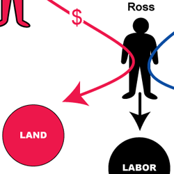
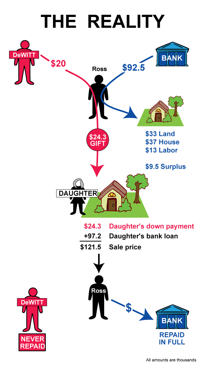
Legal graphic: Real estate fraud
Background to the Design
One poster (first graphic here) shows the plan that the defendant had tricked the plaintiff into agreeing to. The second (second graphic here) shows what actually happened.
Note: Because of the complexity of each case, the attorneys want simple posters crystallizing some critical part of their case that the jury can stare at when they get bored. Attorneys typically hand me a tall stack of legal briefs and leave it to me to discern the essentials of their case to present visually. All names have been changed here.
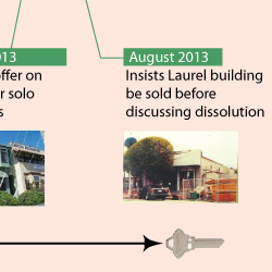
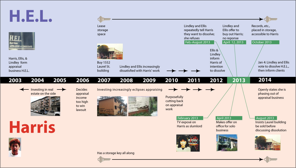
Legal graphic: Timeline for corporate law trial
Background to the Design
The defense’s case largely hinged on when things happened, so I created three timelines: this overall timeline and one each for the two most critical years. In each, the plaintiff’s actions are shown in the bottom half, and the defendants’ and the corporation’s actions are shown in the top half.
Actual size of the poster is 4 ft. x 8 ft.
Note: Because of the complexity of each case, the attorneys want simple posters crystallizing some critical part of their case that the jury can stare at when they get bored. Attorneys typically hand me a tall stack of legal briefs and leave it to me to discern the essentials of their case to present visually. All names have been changed here.
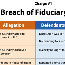
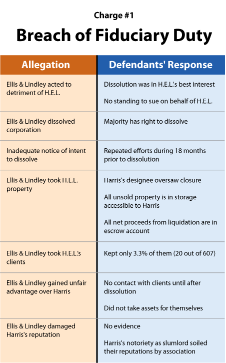
Legal graphic: Allegation and response for corporate law trial
Background to the Design
The defense (my client) had strong responses to each of the plaintiff’s many allegations. This is one of a dozen allegation/response posters.
Note: Because of the complexity of each case, the attorneys want simple posters crystallizing some critical part of their case that the jury can stare at when they get bored. Attorneys typically hand me a tall stack of legal briefs and leave it to me to discern the essentials of their case to present visually. All names have been changed here.
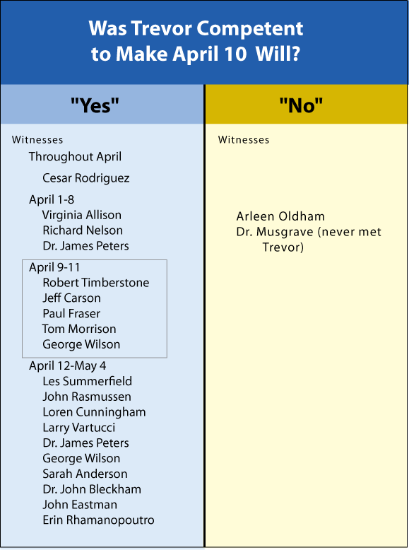
Legal graphic: Inheritance dispute
Background to the Design
This trial hinged largely on whether a man really intended to leave his ranches to his children or to his second wife, Arleen. She argued that he was not competent to make the will that clearly left the ranches to his kids.
Note: Because of the complexity of each case, the attorneys want simple posters crystallizing some critical part of their case that the jury can stare at when they get bored. Attorneys typically hand me a tall stack of legal briefs and leave it to me to discern the essentials of their case to present visually. All names have been changed here.
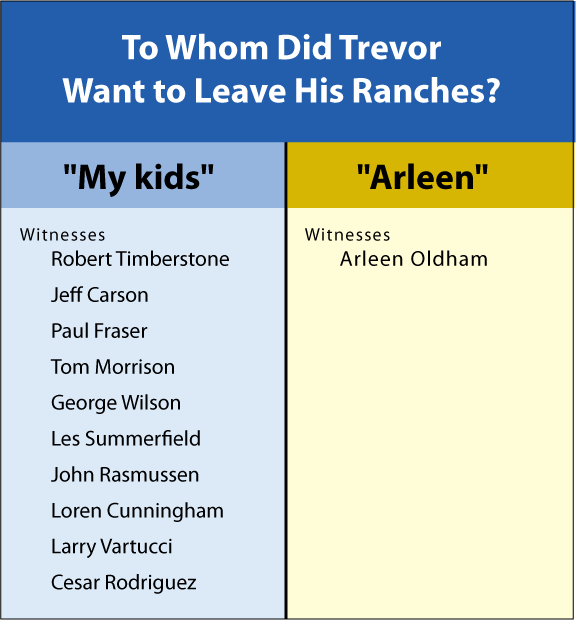
Legal graphic: Inheritance dispute
Background to the Design
Trevor’s second wife, Arleen, contested his will, claiming he meant to leave his ranches to her. All other witnesses testified he had told them he wanted to leave the ranches to his kids.
This poster dramatized that mismatch.
Note: Because of the complexity of each case, the attorneys want simple posters crystallizing some critical part of their case that the jury can stare at when they get bored. Attorneys typically hand me a tall stack of legal briefs and leave it to me to discern the essentials of their case to present visually. All names have been changed here.
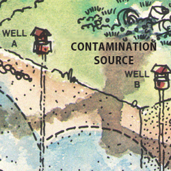
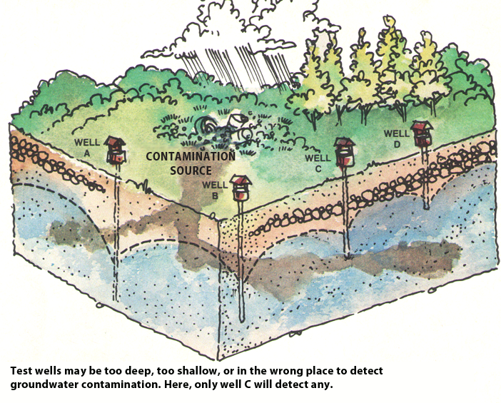
Groundwater contamination
Background to the Design
This illustration shows why a single well is not enough to detect groundwater contamination. I sketched out the concept; someone else drew the art.
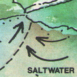
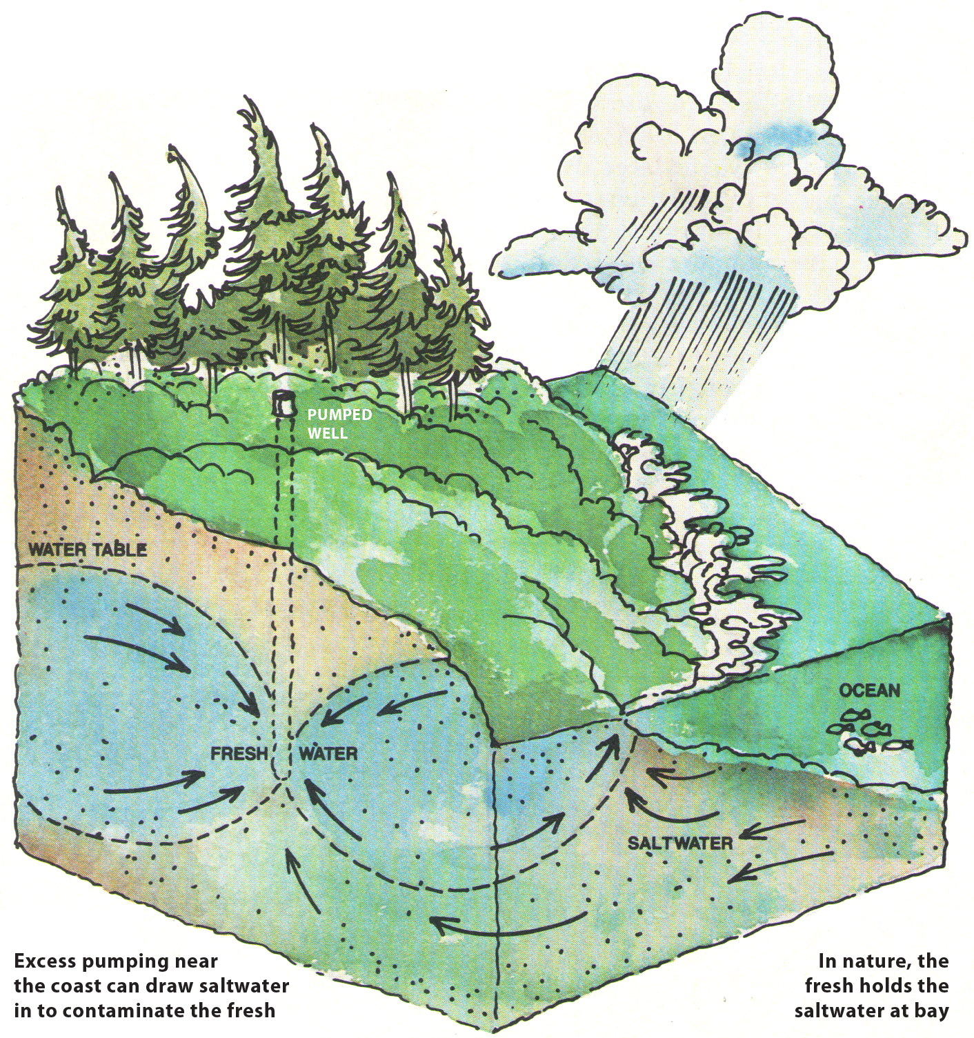
Pumping too much groundwater near the coast
Background to the Design
This illustrates how an over-pumped well near the coast gets contaminated with saltwater. I sketched out the idea; someone else drew the art.
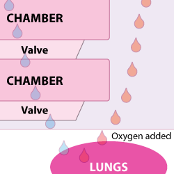
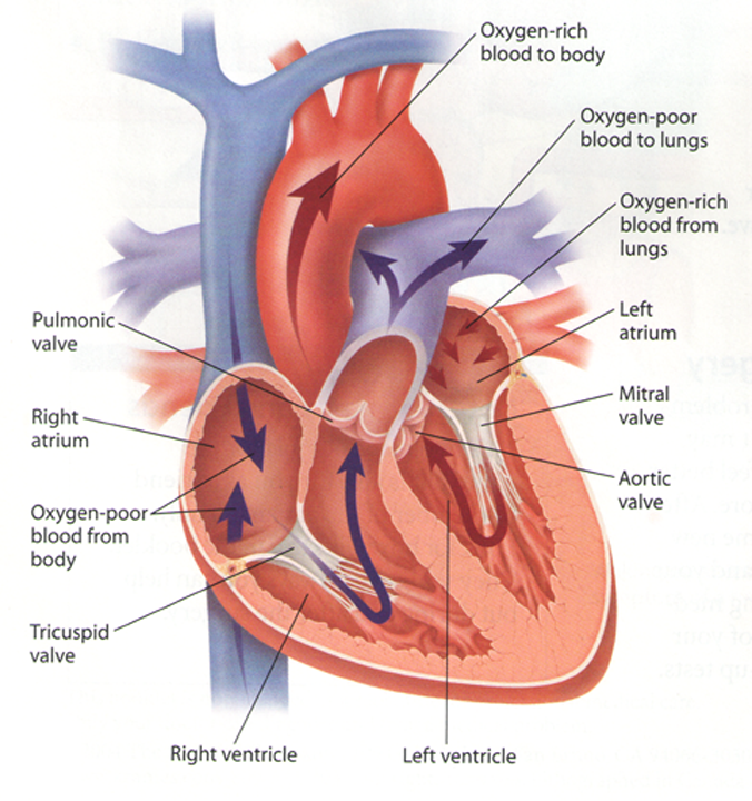
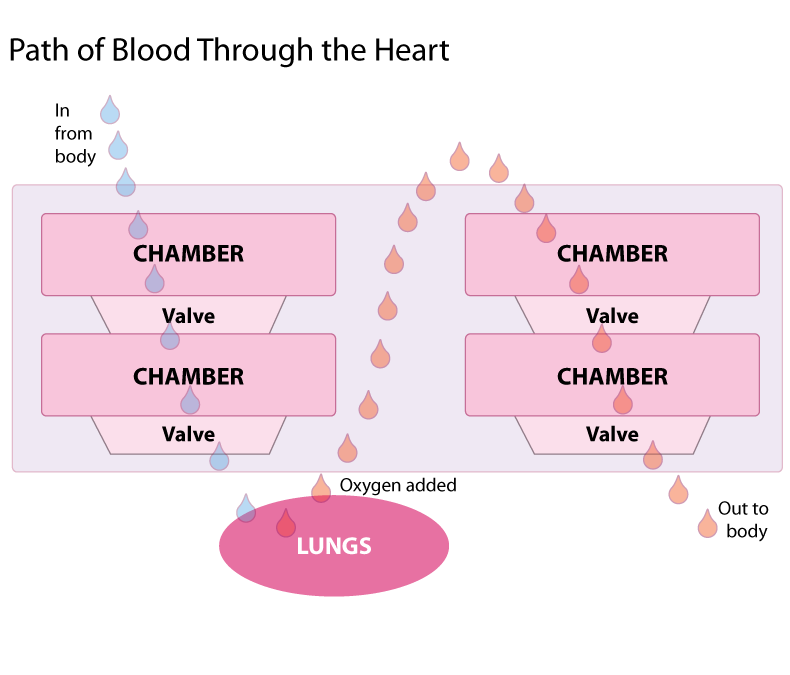
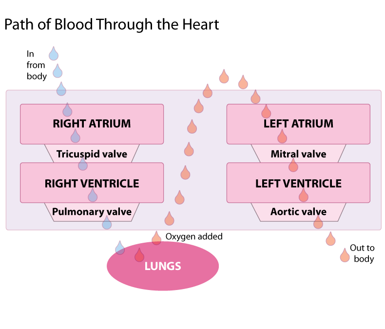
How the heart works
Background to the Design
Anatomically, the heart is very complex. Functionally, it’s very simple.
Yet doctors, health publications, and attorneys in cardiac cases almost invariably try to introduce the heart to laymen with a confusing anatomical drawing, like the first image below.
A much more effective way, I believe, is to:
1. introduce the heart in a simple schematic showing how it functions, with generic terms
2. then replace the generic terms with the actual medical terms
3. only then does an anatomical drawing begin to make sense.
Original
Redesign
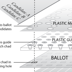
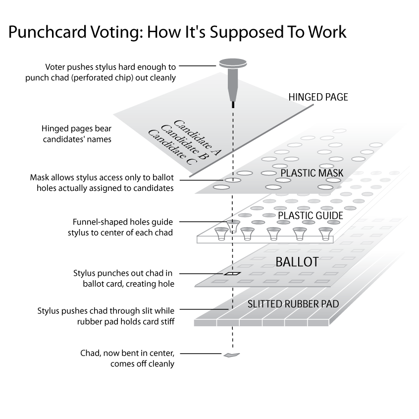
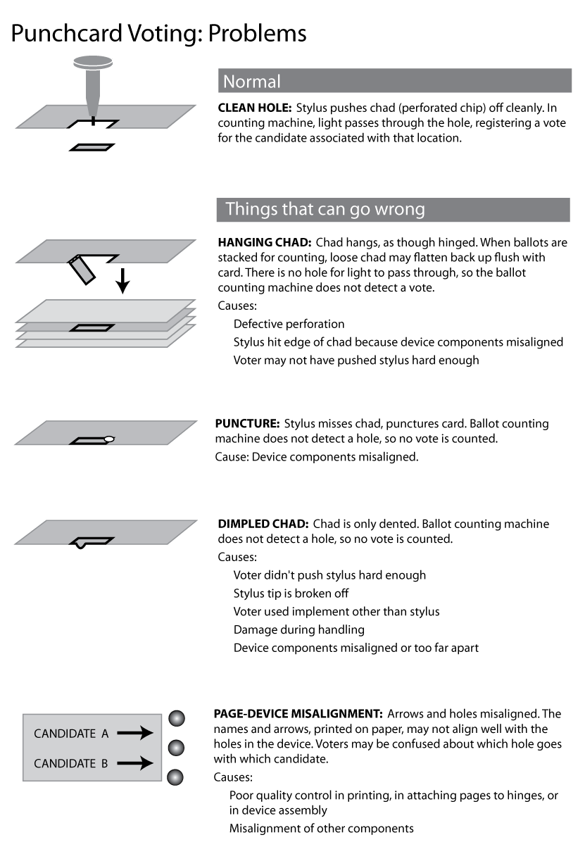
How punchcard voting is supposed to work
Background to the Design
The 2000 presidential election fiasco in Florida introduced the term “hanging chad” to the world. The dueling certainties thrown about by pundits, partisans, and the press reflected little or no understanding of how punchcard voting devices actually work and why anomolies happen. Having once worked in the election field, I put together this pair of illustrations to show how the system is supposed to work and what can go wrong.
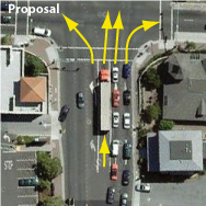
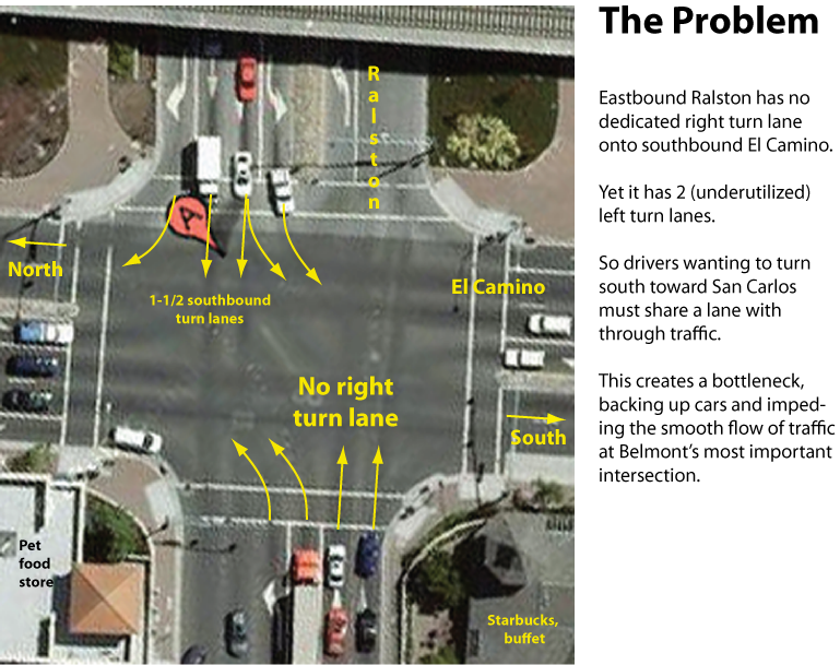
Proposal to solve a traffic bottleneck
Background to the Design
The city of Belmont, California, has a traffic bottleneck at its main intersection due to the lack of a dedicated right-turn lane. A city commission considered a proposal to solve the problem, but expressed one key concern.
The graphic below is one page from a full PowerPoint deck that addresses that concern. It was designed to be freestanding so city officials could circulate it among themselves and review it on their own.
The deck includes important animations that work only in slideshow mode on full versions of PowerPoint on a computer.
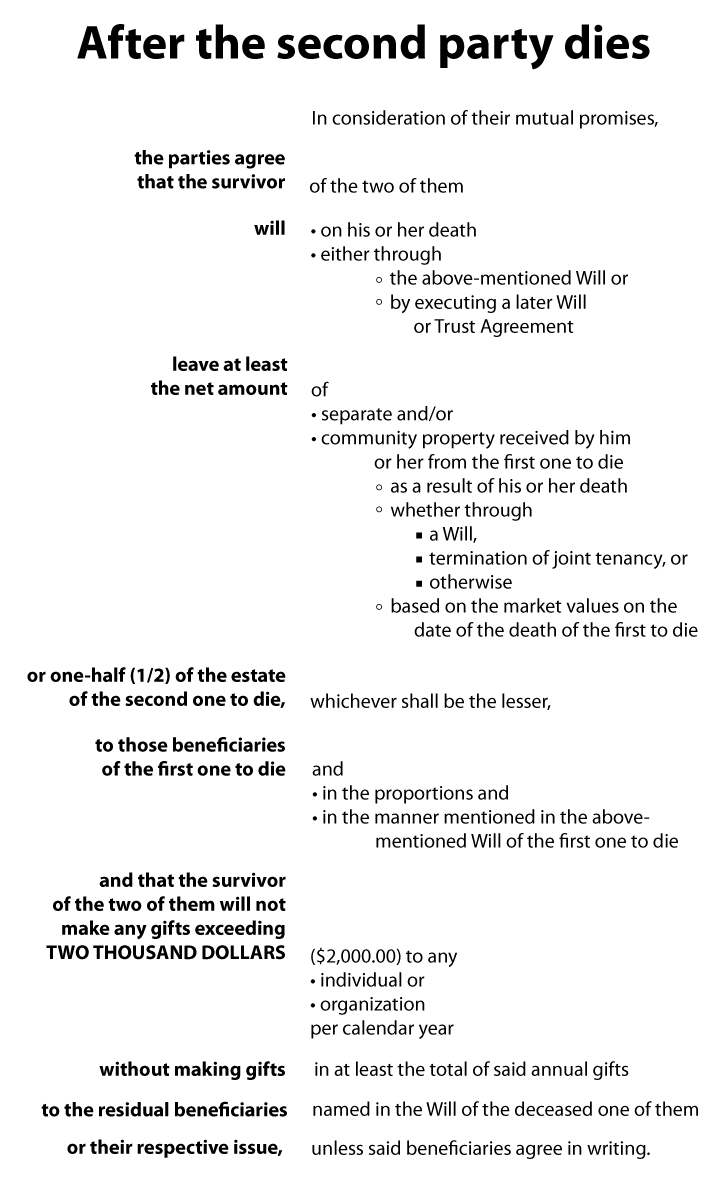
This poster takes a 215-word sentence of legalese and breaks it up visually to make it easier for the jury to parse. The essential thrust of the sentence is in the left column, with the details in the right. No words or punctuation are changed or omitted.
Note: Because of the complexity of each case, the attorneys want simple posters crystallizing some critical part of their case that the jury can stare at when they get bored. Attorneys typically hand me a tall stack of legal briefs and leave it to me to discern the essentials of their case to present visually. All names have been changed here.
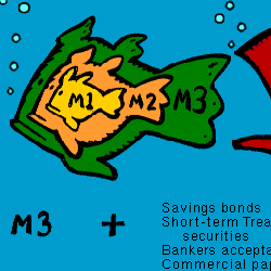
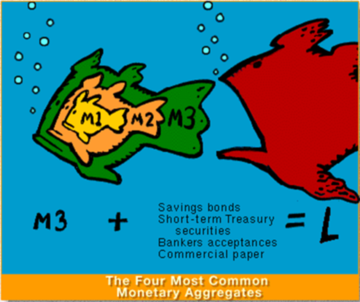
4 measures of money in the economy
Background to the Design
There are four different ways to measure the amount of money in the economy, called M1, M2, M3, and L. This image, the fourth in a series, shows the relationship among all four measures. It was for teaching macroeconomics.
I sketched out the concept. Someone else drew the art.
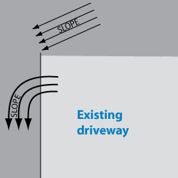
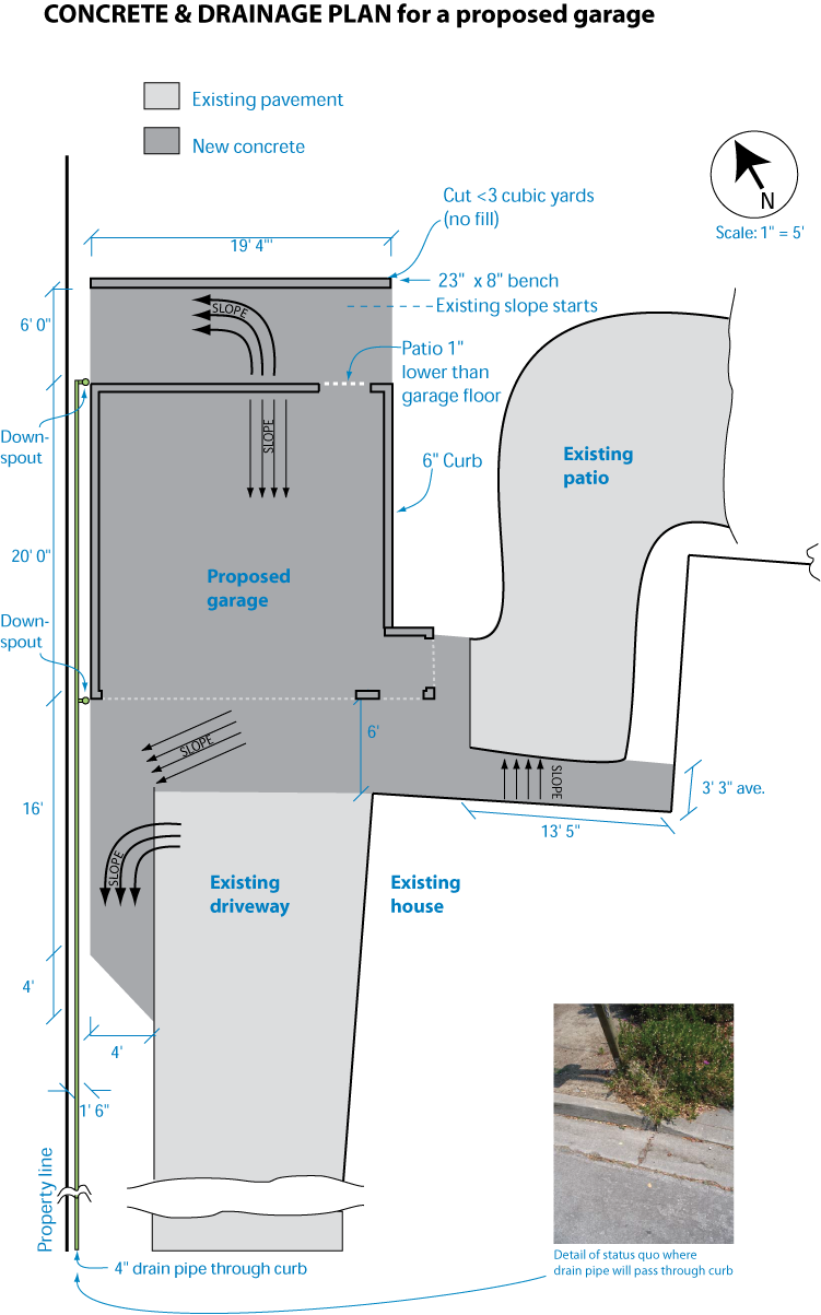
Concrete & drainage plan for a new garage
Background to the Design
This is one of many drawings that enabled municipal inspectors to approve the plans for a new garage and gave the concrete contractor his orders.
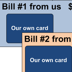
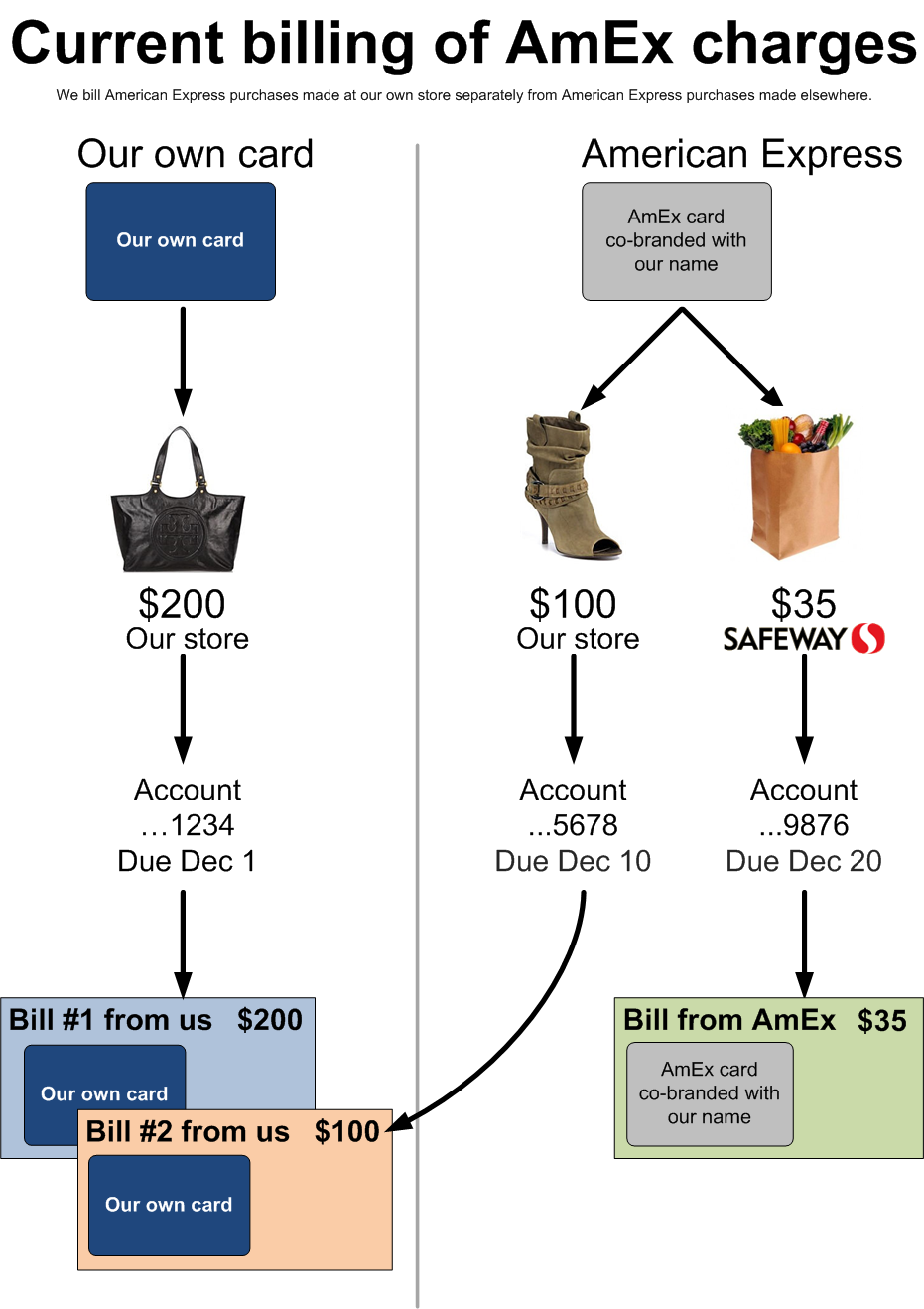
Confusing credit card practice
Background to the Design
A retailer offered a co-branded American Express card. Customers who had that one single card would receive two separate bills each month, as though they had two different cards. Confused and angry, they would call customer service demanding an explanation.
Unfortunately, the retailer’s business rules for the card were so confusing that even the customer service reps didn’t really understand them (nor did hardly any of the retailer’s other employees).
I couldn’t change the business rules, so the best I could do was to create this infographic so customer service reps and others would at least understand what the rules were.
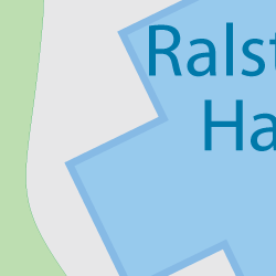
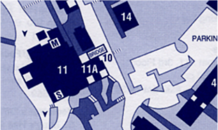
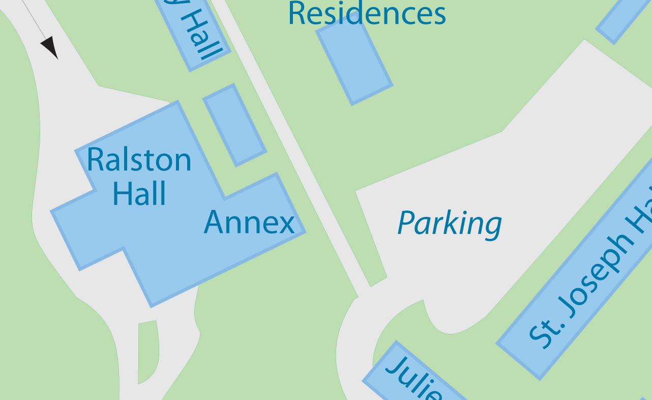
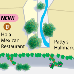
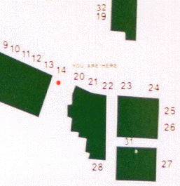
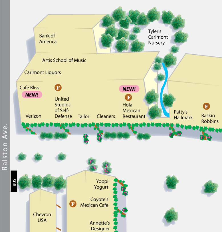
University map
Background to the Design
Like most You Are Here maps, the old map for Notre Dame de Namur University was a recycled architectural drawing. The result was a jangle of useless detail. As meaningful as that detail would be to architects, it was noninformative to visitors trying to find a building. Below is an excerpt of the old map and the corresponding excerpt of my new map.
You Are Here maps typically suffer from two problems: visual noise and a coding system instead of place names. Coding forces you to look back and forth between numbers on the map and a separate directory of place names. My designs try to eliminate both problems, making it easier to find what you’re looking for. A directory then becomes an optional extra.
Original
Redesign
Video: Hauling dirt uphill
Background to the Design
This video shows how to make a simple sled to haul dirt, bricks, or other heavy stuff up a hill. I created it for a handyman magazine.
Shopping center map
Background to the Design
Like many You Are Here maps, the old Carlmont Shopping Center map was misoriented to its environment, sending people left when they should go right. Buildings that shoppers perceive as a single unit were shown as separate shapes. And there was no hint of the center’s quaint charm.
Below is an excerpt from the old map and the corresponding excerpt of my redesign.
You Are Here maps typically suffer from two problems: visual noise and a coding system instead of place names. Coding forces you to look back and forth between numbers on the map and a separate directory of place names. My designs try to eliminate both problems, making it easier to find what you’re looking for. A directory then becomes an optional extra.
Original
Redesign
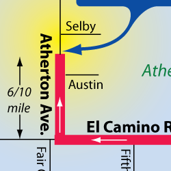
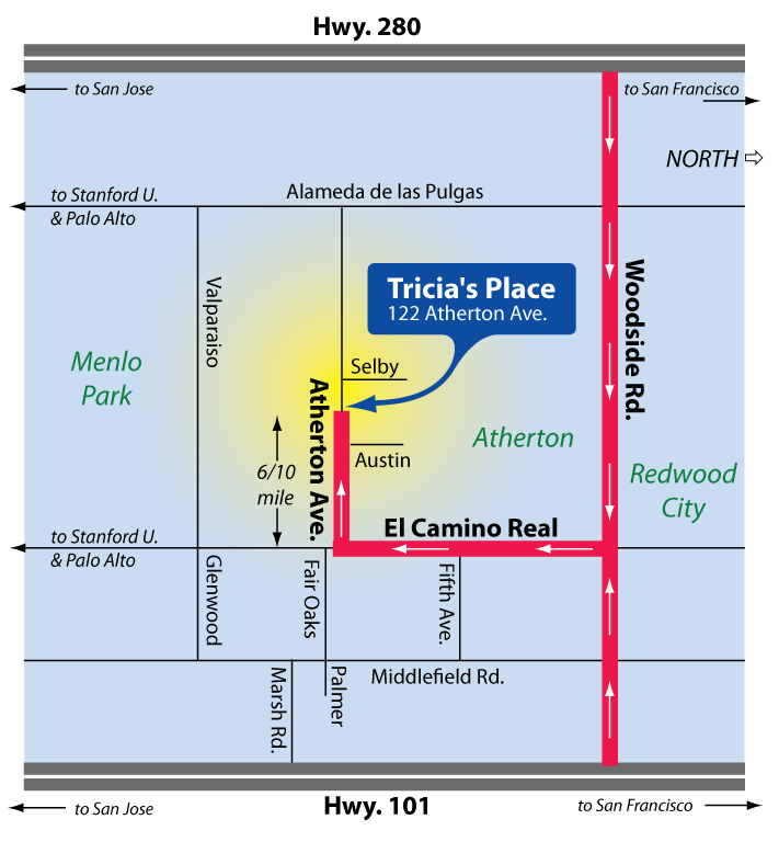
Bed & breakfast inn map
Background to the Design
This map on a B&B’s site had four purposes:
1. to save the innkeeper the trouble of giving directions over the phone ten times a day
2. to get guests to the inn easily no matter which direction they are coming from
3. unlike a generic (i.e., Google) map, to spotlight the inn’s location and the easiest route to get there
4. unlike Google maps, to print full-page and to work just as well when printed in black and white as in color
This map was supplemented with a wider context map showing the entire San Francisco Bay Area.
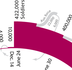
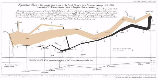
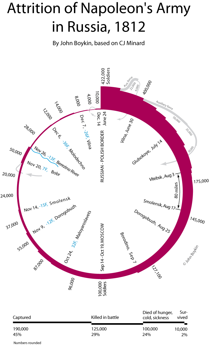
Redesigning a classic
Background to the Design
Can a classic be improved? This is a redesign of CJ Minard’s graphic of Napoleon’s blunder in Russia.
Original
Redesign
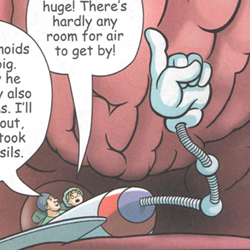
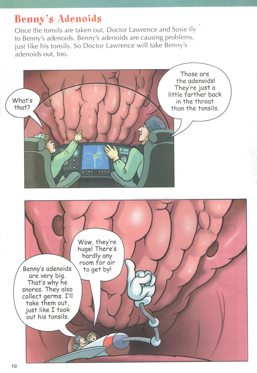
Health booklet for 4-year-olds
Background to the Design
Krames publishes booklets on health topics for doctors to hand to their patients. This 16-page booklet is for parents to read to their very young children who will be having surgery to remove tonsils and/or adenoids.
This was an overhaul of one of Krames’ best sellers. The original booklet featured a character named Jimmy the Giant, whom Dr. Lawrence treats while walking around inside his throat.
I changed the concept to an ordinary kid, Benny, who has trouble sleeping and breathing because of tonsil and adenoid problems. In Bennie’s dream, Dr. Lawrence borrows Benny’s toy spaceship and shrinks himself and it down small enough to fly around inside Benny’s throat. His sister Susie comes along to watch.
I came up with the entire story concept, sketched out the initial storyboard in consultation with the visual designer, and wrote all the text and dialogue. It was reviewed by 6 doctors, 2 nurses, and a few parents and kids.
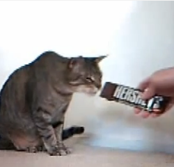
Video to evangelize user-centered design
Background to the Design
I often need to talk to colleagues or clients about why their own opinions and preferences–and mine–are less important than those of their site’s users.
I created this 3-minute video, called “Satisfy the Cat, a.k.a. User-Centered-Design,” to illustrate the point.
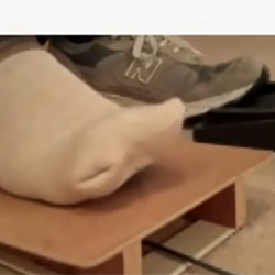
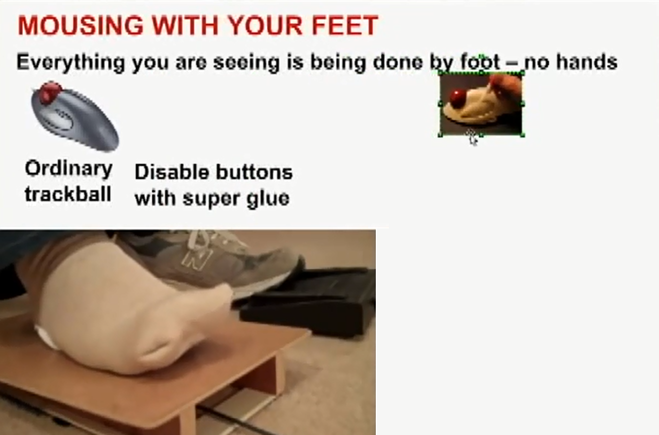
Video: Mousing with your feet
Background to the Design
I made this video to demonstrate a method of controlling a computer with your feet. The method is helpful for people with a disability, who just want to prevent repetitive stress injuries to their hands, or who enjoy freeing their hands to do other things.